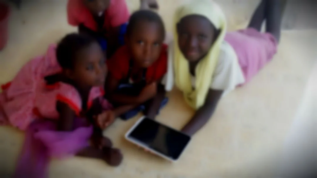
User Analysis of 7 -10 year old Jambiani kids
Yesterday I was sitting on my porch and two young girls came and hang around smiling shyly. They want to play games on my phone. We tried a few English ones but their eyes lit up when I showed them some in Swahili.
They really enjoyed a simple alphabet game for about an hour. As an educational software developer, this is a great opportunity for me to observe their joys and frustrations. I have been doing this for a few weeks now.
Lessons Learnt
As I have pretty limited Internet and electricity (sometimes) I will keep this as quick bullet points for now:
- No one has ever used an app as solo. There are between two and ten fingers on the screen at any time. They turned it into a new game of who can find the correct letter and drag it to the centre first. The conversations they were having about the correct answer was where the real learning was happening.
- The older kids will pick up the younger one's fingers and show them where to touch or drag and drop
- When the group gets large..say past 7 there are issues with pushing and shoving. In smaller groups they manage sharing and turn taking quite well.
- I showed them a simple three frame comic I made last week. I invited them to add their own photos and type in their name. I had to help with most interface interactions but asked each child to type in their name. I realised that this was the first time they had done this using a keyboard. They all knew how to spell their name and slowly found each letter on the keyboard. They only asked me once to find 'b'. The older ones helped the younger ones and each had a fair turn.
- Then my own children turned up and joined in. They knew how to use this program so did it on their own. I am sure the older kids were watching them closely and would now like to experiment with all of the buttons in the program. As it is a good interface, I am sure they will figure most of it out on their own and then refer to my kids for help when stuck.
UI/UX issues
The main frustrations I see in UI are
- Accidently leaving apps and not being able to get back in
- Paid levels and ads flashing and enticing kids into dead ends
- Too many options on one screen which accidently get touched when you have ten fingers on a screen
- Too many clicks to get started
- Issues with drag and drop sensitivity and responsiveness
- Getting back to home and changing games
Unexpected benefits
The main frustration for me has been my very limited Swahili, which I now realise is a benefit. Usually when I do this type of micro user analysis I have a set task and watch a few people try to perform it. I take extensive notes and capture their thoughts along the way. I probe them with questions about why they made that choice but rarely help when they are stuck. This time I can hear the constant chatter but have no idea what they are saying, I'm just listening and watching. Now I realise that is a blessing because I am not interrupting the natural process. Without words, I am more tuned into the emotion. When do they get the moment of first (success) ? When do they get the opportunity to mentor another child and feel powerful? When do they quit? I don't need to understand Swahili to observe the emotions of the learning experience.
I will take all of these observations on board and integrate them with the Dev4X prototype we are developing. So far my time playing with these kids has encouraged me that we are on the right track.


